Overview
The goal here is to estimate movement among polygons over a defined period of time using a BirdFlow model. The result is a square movement matrix where the rows correspond to starting polygons and the columns to ending polygons. Values are the proportion of the total population making each movement, which can be scaled to represent numbers of birds. Optionally each value can be adjusted by the area of the two associated polygons to get a mean movement per square kilometer.
The original motivation for this workflow was modeling how migratory wild birds might drive the spread of highly pathogenic avian influenza (HPAI H5N1) into cattle and poultry operations across the United States. Migratory waterfowl and shorebirds carry HPAI between regions as they move, and the polygon movement matrix provides a spatially explicit predictor of where and when the wild-bird reservoir is likely to seed new outbreaks — an input to epidemiological models used to inform biosecurity decisions.
In the example here the polygons are US States, but the variable
(polys) and the sole required column name (id)
are kept deliberately generic so the code will work with any set of
polygons.
The approach:
- Load model, set start and end times for connectivity window, and set total population.
- Download and prepare polygons
- Calculate the overlap between active cells in the BirdFlow model and the polygons.
- Generate starting distributions for each polygon that represent the portion of the species distribution that is in each polygon at the start of the movement.
- Run
predict()using distributions and start and end time. - Drop time dimension from result preserving just the end distributions.
- Convert the ending distribution from model cells to polygons.
- Optionally, multiply by the species’ total population (within the Americas) to convert from proportion of population to estimated number of birds
- Optionally, divide by the area of both the starting and ending state to make the estimates per unit area - eliminating the polygon size as a factor in the connectivity. This step is not appropriate for all use cases.
Load model and set parameters
This example uses the American Woodcock dataset from BirdFlowModels which is small and runs fast but isn’t fully vetted for scientific use.
Use load_model() for real work.
bf <- BirdFlowModels::amewoo  # you will likely use load_model() instead
start <- BirdFlowR::lookup_timestep("2024-01-15", bf)
end <- BirdFlowR::lookup_timestep("2024-03-20", bf)
population <- 3500000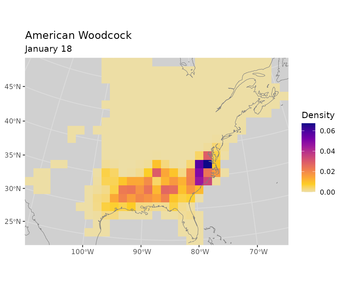
Load Polygons
Use get_states() to get the state boundaries within
BirdFlow object extent from theNatural Earth data set.
If you have a polygon shapefile already you could use
polys <- sf::read_sf(shapefile_path) and skip this
section.
#  Note this code requires the rnaturalearthhighres package so is not
# run when building the vignette.

polys <- get_states(bf, country = "United States of America",
                    keep_buffer = TRUE,
                    keep_attributes = TRUE)

polys <- dplyr::select(polys, NAME = gn_name)
Prepare polygons for analysis
- Add an
idfield; in this example it is the state names. - Transform to match the BirdFlow Coordinate Reference System (CRS).
- Calculate the area in square kilometers of each polygon
(
sq_km). - Add centroid coordinates (
x,y) in the BirdFlow CRS.
# Add generic "id" column (use state name)
polys$id <- polys$NAME

# Order by id (optional)
polys <- polys[order(polys$id), ]

# Transform to match the BirdFlow model CRS
polys <- sf::st_transform(polys, crs(bf))

# add sq_km to polygons
# This assumes the projection is in meters which is true for BirdFlow models
polys$sq_km <- sf::st_area(polys)  / 1000^2  |> as.vector()

# Add centroids (only used for the plotting at end of document)
centroids <- sf::st_centroid(polys[, "geometry"]) |> sf::st_coordinates()
colnames(centroids) <- c("x", "y")
polys <- cbind(polys, centroids)
Calculate overlap between active BirdFlow cells and polygons
Make the overlap matrix. Rows correspond to active
cells, and columns to the external polygons. The values are the
proportion of the cell that overlaps the polygon.
# Convert active cells to polygons
cell_polys <- rasterize_distr(seq_len(n_active(bf)), bf, format = "terra") |>
 terra::as.polygons() |>
  sf::st_as_sf()
names(cell_polys)[1] <- "i" # BirdFlow location index "i"

# Intersect cells with polygons
suppressWarnings( # Attribute values assumed to be spatially constant...
  intersection_polys <- sf::st_intersection(cell_polys, polys)
)
intersection_polys <- intersection_polys[, c("i", "id")]
intersection_polys$area <- sf::st_area(intersection_polys)
sq_m_per_cell <- prod(res(bf))
intersection_polys$prop_of_cell <- intersection_polys$area / sq_m_per_cell

# Calculate the proportion of each cell that overlaps each polygon
# Rows = active cells, columns = polygons
overlap <- matrix(0, nrow = n_active(bf), ncol = nrow(polys),
                  dimnames = list(i = seq_len(n_active(bf)),
                                  id = polys$id))
intersection_polys$row <- match(intersection_polys$i, seq_len(n_active(bf)))
intersection_polys$col <- match(intersection_polys$id, polys$id)
row_col_index <- intersection_polys[, c("row", "col")] |>
  sf::st_drop_geometry() |>
  as.matrix()
overlap[row_col_index] <- intersection_polys$prop_of_cell |> as.vector()
Build initial distributions
This essentially clips the initial distribution separately to each polygon while assigning values from boundary cells in proportion to their overlap with the polygon.
Note, a single BirdFlowR distribution is a vector of length
n_active(bf) multiple can be stored in a matrix with
n_active(bf) rows. The matrix here has a column
(distribution) for each polygon in polys.
start_distr <- matrix(get_distr(bf, start),
                              nrow = n_active(bf),
                              ncol = nrow(polys),
                              byrow = FALSE,
                              dimnames = list(i = NULL,
                             start_poly = polys$id))

start_distr <- start_distr * overlap
Visualize the distribution for one polygon
Visualize the initial distribution for the polygon with the highest initial abundance (North Carolina).
sel <- which.max(apply(start_distr, 2, sum))
plot_distr(start_distr, bf, subset = sel) +
  ggplot2::geom_sf(data = polys,
                   inherit.aes = FALSE,
                   linewidth = 0.2,
                   color = "black",
                   fill = NA)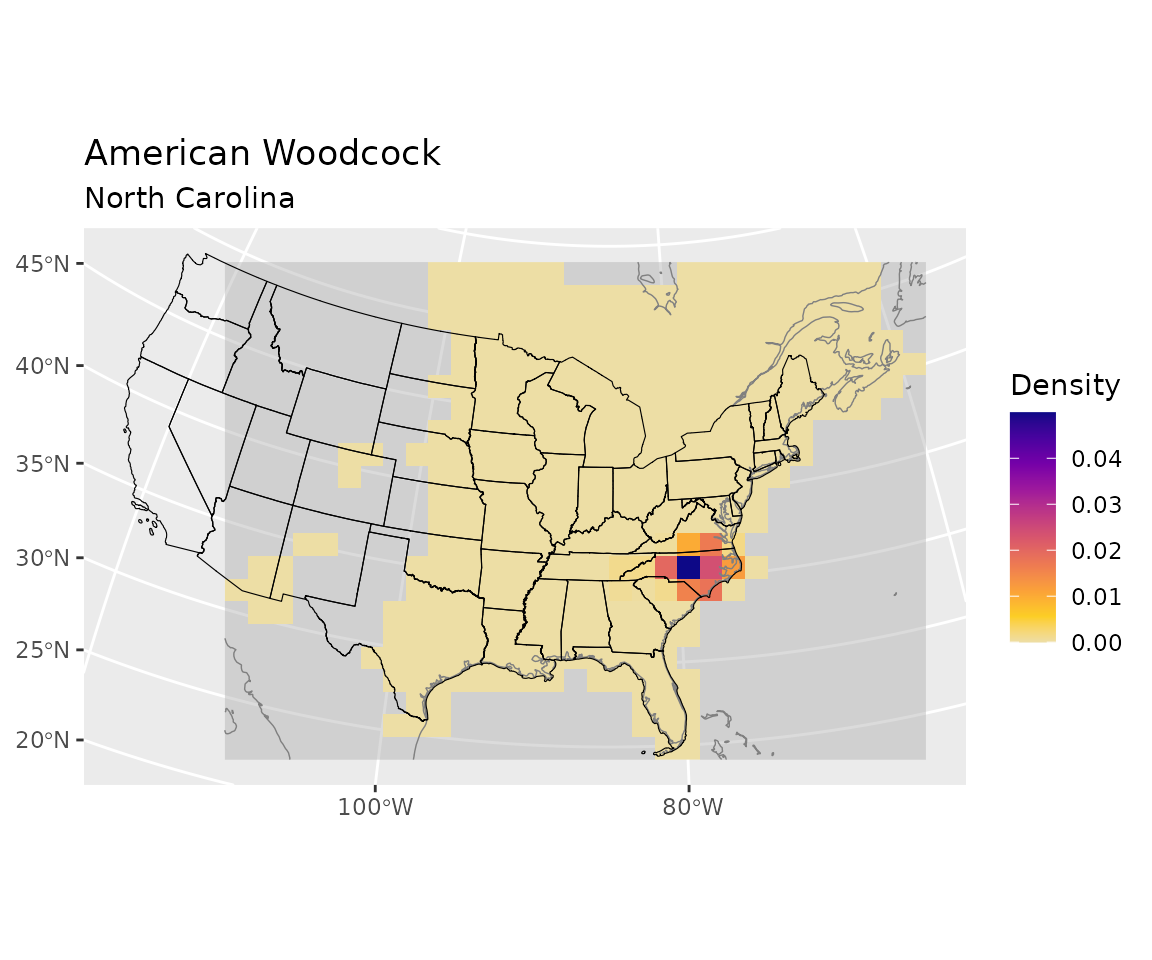
Project the distributions forward
Use BirdFlowR::predict() to project the distributions
forward. With multiple input distributions the output will be a three
dimensional array. Select the last element of the third dimension to get
just the ending distributions in a matrix. The values in these
distributions represent the proportion of the population that started in
the corresponding polygon (columns) that ended in each active cell
(rows).
# Project distributions forward to end date
pred <- predict(bf, distr = start_distr, start = start, end = end)

# Just keep last distribution
end_distr <- pred[, , dim(pred)[3]]

# Preserve dimension names
dimnames(end_distr) <- dimnames(start_distr)
Visualize the ending distribution
This shows the ending distribution for the birds that started in North Carolina.
plot_distr(end_distr, bf, sel) +
  ggplot2::geom_sf(data = polys,
                   inherit.aes = FALSE,
                   linewidth = 0.2,
                   color = "black",
                   fill = NA)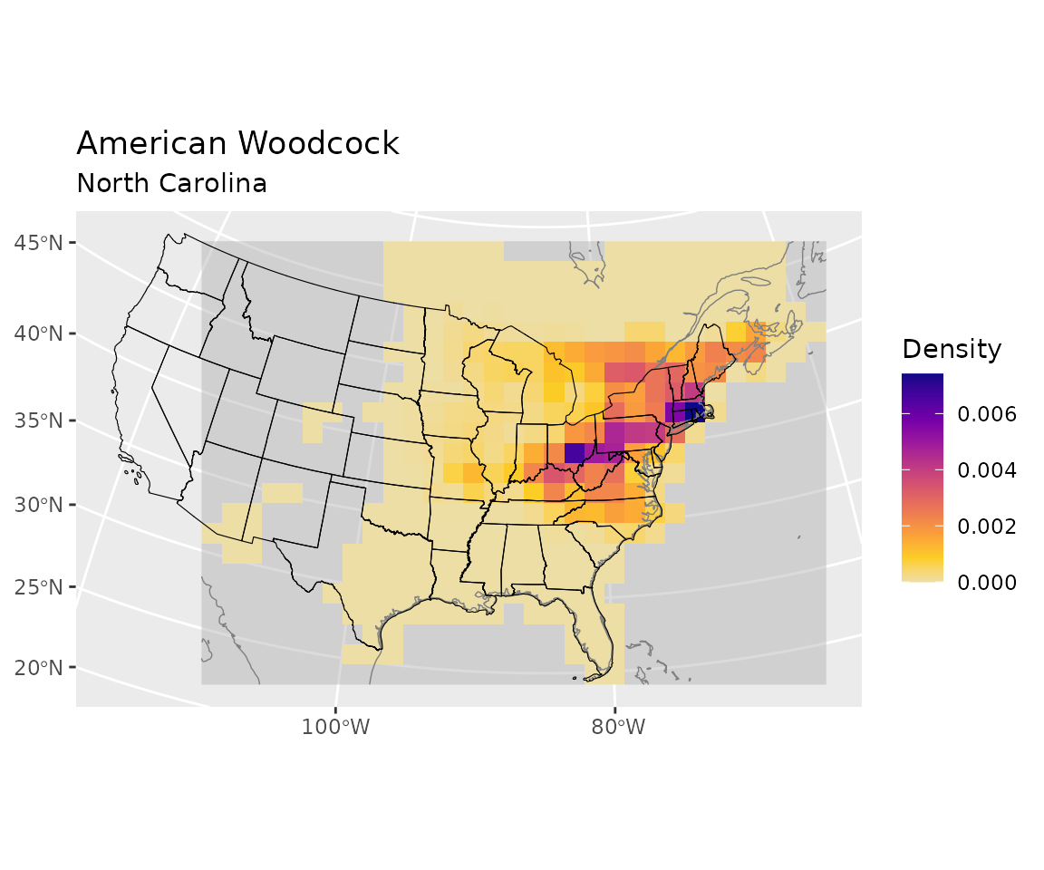
Collapse the ending cells into ending polygons
Convert the end_distr destination cells into destination
polygons based on the overlap proportions in overlap.
The result is move: a matrix with rows for starting
polygons, columns for destination polygons, and values that are the
proportion of the total population making each transition.
# Each entry move[from, to] is the proportion of the total population
# that started in polygon "from" and ended in polygon "to".
move <- t(end_distr) %*% overlap
dimnames(move) <- list(from = polys$id, to = polys$id)
Visualize the polygonized end distribution
Plot the proportion of the total population that moved from
North Carolina to each each state.
polys$Proportion  <- move[sel, ]

gradient_colors <-
      c("#EDDEA5", "#FCCE25", "#FBA238", "#EE7B51", "#DA596A", "#BF3984",
        "#9D189D", "#7401A8", "#48039F", "#0D0887")

ggplot2::ggplot(data = polys) +
  ggplot2::geom_sf(ggplot2::aes(fill = Proportion)) +
  ggplot2::scale_fill_gradientn(colors = gradient_colors) +
  ggplot2::ggtitle(paste0(species(bf), " movement from ", polys$id[sel]),
                   subtitle = paste0(lookup_date(start, bf), " to ",
                                     lookup_date(end, bf)))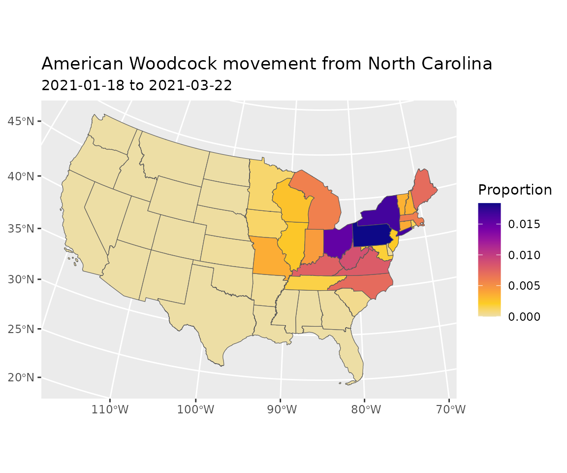
Adjust for population (optional)
You can multiply the movement by the total population of the species to estimated the number of individuals making each movement. This is likely necessary to aggregate or compare output across species.
# Convert to absolute numbers of Birds expected to move between
# each pair of polygons
move_count  <- move * population
Adjust for area (optional)
Adjusting for area might be appropriate depending on the application. If the goal is to capture the total magnitude of movement between each source and destination polygon than do not adjust for area.
However, in our initial use case our points were in the specified states but did not represent the entire state so failing to adjust for state area would introduce a bias - essentially inflating movement for points that fell in bigger states. Similarly if you want an average per unit area movement between states that isn’t biased by state area you would adjust for area.
The adjustment is done by dividing the number of individuals moving between the two polygons by the area of each polygon in sq km to produce the expecting number to move between them per sq km at each end. Clearly, though this does not capture the fine scale variability within them some of which is captured in the original BirdFlow cells.
Visualize movement
plot_count_threshold <- 1000 # only plot lines for big movementsPlot non-zero estimated counts of birds moving between polygons and indicate magnitude with line thickness. Lines are only shown for movements of at least 1000 individuals.
n <- nrow(polys)
long <- data.frame(from =  rep(polys$id, times = n),
                   to = rep(polys$id, each = n),
                   count = as.vector(move_count))

# Add coordinates of centroids of to and from polygons
f_mv <- match(long$from, polys$id)
long$f_x <- polys$x[f_mv]
long$f_y <- polys$y[f_mv]
t_mv <- match(long$to, polys$id)
long$t_x <- polys$x[t_mv]
long$t_y <- polys$y[t_mv]

long <- long[long$count >= plot_count_threshold, ]

ggplot2::ggplot(long) +
  ggplot2::geom_segment(ggplot2::aes(x = f_x, y = f_y,
                                     xend = t_x, yend = t_y,
                                     linewidth = count),
                        color = rgb(0, 0, 0, .15)) +
  ggplot2::scale_linewidth(range = c(0.2, 4)) +
  ggplot2::theme(axis.title = ggplot2::element_blank(),
                 strip.background = ggplot2::element_blank()) +
  ggplot2::geom_sf(data = polys,
                   inherit.aes = FALSE,
                   linewidth = 0.2,
                   color = "black",
                   fill = NA)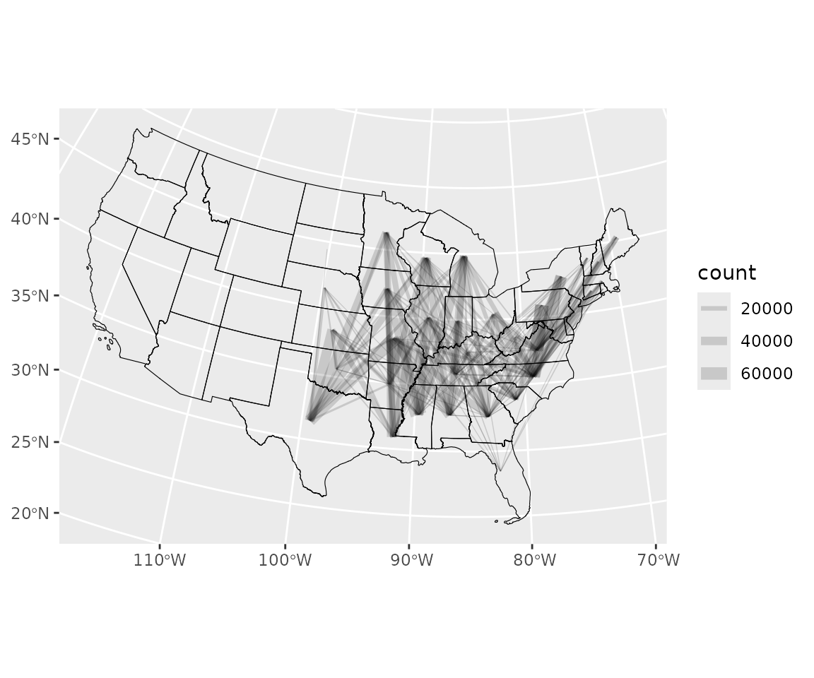
Connection to the distribution data structure
Throughout this workflow, BirdFlow distributions appear in a familiar
form: a numeric vector of length n_active(bf), one value
per active cell. start_distr and end_distr are
simply matrices of such vectors — one column per polygon — so every
operation that works on a single distribution (plotting with
plot_distr(), rasterizing with
rasterize_distr(), passing to predict()) works
column-by-column on the whole matrix. The polygon workflow is therefore
a direct extension of the core data structure from the BirdFlowR
overview: the movement matrix move is computed entirely
through standard matrix operations on those same distribution
vectors.